

After producing an AI trailer, generating hundreds of AI images for Uncharted Territories, and analyzing dozens of poster submissions for our online shop—many of them generated by AI—, I’ve come to realize why people generally dislike AI images, and I think it’s the same reason we don’t like AI text.
In this article I’ll do two things:
Go through some of the AI posters people submitted, to discuss why people generally dislike AI art.1
Analyze the rest of the posters, and announce the winner of the $1,000 competition.
Shallow Intent
This was the first poster of the competition:
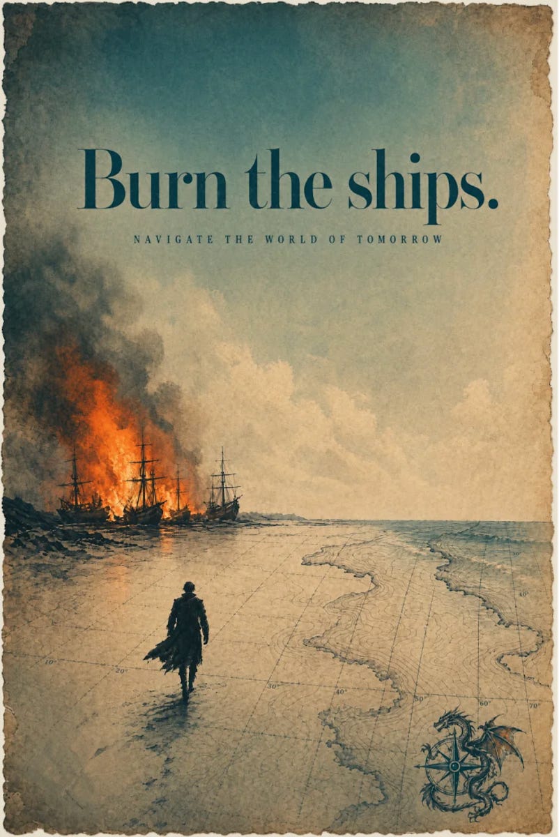
At first sight, I was impressed: It really captured the Uncharted Territories mindset at two levels. First, the idea of Burn the ships, which I’ve written about here, harks back to Hernán Cortés’s conquest of Mexico, and his act of burning (actually, scuttling) the ships they came in so that his men could only look forward, towards the adventure, the uncharted territories.
Second, the aesthetic execution is great: the edge of the poster is like old parchment, the teal and golden colors are the same palette as UT, the orange accent color in the fire, the ship of the Age of Discovery, the lines in the water as topographic map lines…
But then you start paying attention to the details, and some things start being off:
Why is he wearing what looks like 1800s English garb? These are 1500s Spanish conquistadors.
How did the ship make it so far inland?
Why is the dragon a mix of Western and Eastern styles? Why does the dragon have what looks like a second tail?
Why is the man walking towards the ships?
A human would probably not have drawn that, especially that last point: If the creator had enough insight to create a Burn the Ships poster, they would have understood the meaning, and would have portrayed the man leaving rather than approaching. The point is the exact opposite.
So here’s the key insight: I don’t think people mind that an AI has made an image. I think they mind that it’s missing thought. When humans are creating something like this, they need to add every element, one by one, which means they pay attention to every detail. Every stroke is imbued with meaning, the result of the creator thinking: “How should I trace this thing? Why?”
And I think art, in a big way, is the process of the audience reverse-engineering the creator’s thoughts: “Why did the artist make this poster like this? What was he trying to convey? Why did she choose this line, this color, this composition?” I think that’s what makes art meaningful: You’re getting into the artist’s brain, into their knowledge, their emotions.
But when AIs create images, they don’t have emotions, they don’t think critically about every detail. They’re making statistical recombinations of all the images they’ve ever seen, weighed by the words in the prompt. They’re an amalgamation of the Internet’s visuals. They generate the appearance of intention, but in reality, there isn’t any.
So we feel cheated. It takes decades of cultural training for humans to learn the clues that an image has meaning: “Look at the harmony of the composition, look at the swiftness of the stroke, look at the minute detail she painted… The artist really thought about this, therefore, it’s worth my attention.” That is out the window and into the trash, because the AI mimics these features but without the meaning, without the intentionality of the artist. There is visual density without intention density. AI decouples these.
AI art has shallow intent.
Here’s an example of an image I generated last week about a family in Mesopotamia, in Ur, around 2000 BC:
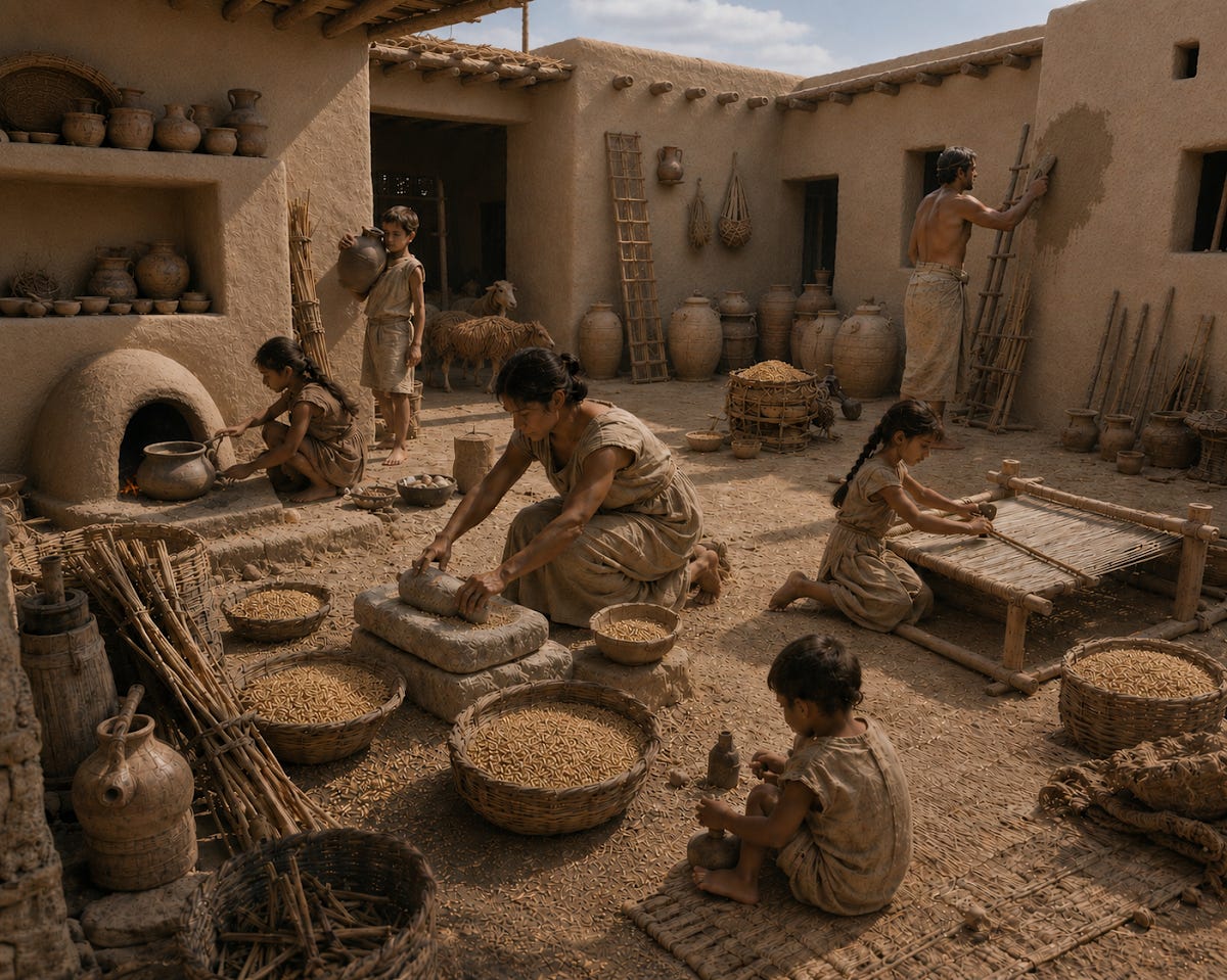
This is the 20th or so attempt, and yet when you ask an AI what’s wrong about it, it tells you everything is wrong: the grain milling position, the stone, the oven, the loom, how the grain is stored, the sheep, the wall surface, the window sizes, the clothing…2 An artist depicting this would have a conversation with a historian to get as many of these details right, but the AI doesn’t do that: It takes whatever is in the prompt, and makes an image that closely resembles that direction. It does try to imply what you mean: For example, when my prompt refers to a Mesopotamian family in 2000 BC, it will fetch references from old history in that place. But AIs don’t yet reason through it. They don’t ask themselves: What would be historically accurate? What elements should be present and absent? I’m sure AIs will have this internal conversation in the future, and that would be akin to the illustrator talking with the historian, but today that’s not the case.
AI Grime
At first sight, an AI image advertises depth, so we feel betrayed when we realize it’s AI and it won’t deliver. As a result, our brains’ immune system gears into action, to spot this however we can. And one of the biggest AI tells is the texture. Here, I zoomed in on the sky of that first poster:
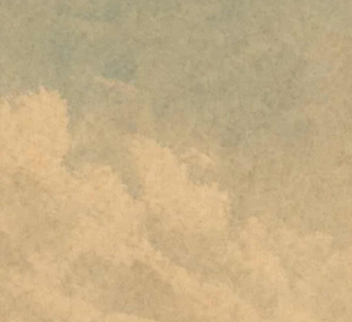
Do you notice how these textures are not uniform? Where a human would make a clean surface, an edge, a gradient, or repeat a texture, AIs continually invent irregular variations, ghost edges, pseudo-details. And these don’t come from human tools: They don’t come from pencil, or oil painting, or watercolors, or programmatic painting, or any other style we know. That makes them uniquely AI. A tell. I’ll call it AI grime.
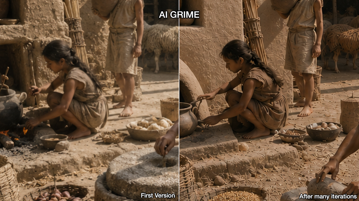
ChatGPT seems to do this a lot right now, and if you take an image and ask it to edit elements, in each round, this effect will increase, so that you end up with a total mess where the AI grime has taken over. Here’s a close-up of the texture of my Mesopotamian family, showing an early version and the latest one side-by-side.
Others have noted similar effects:
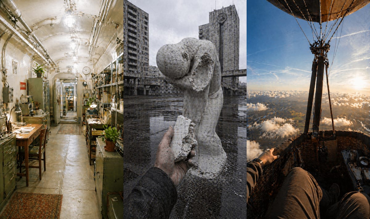
I’m sure they will get better fast, and in 10 years people will probably try to recreate this style for nostalgia, but right now AI grime is an AI tell for “this image lacks insightful thought.”
AI grime signals shallow intent.
AI is fantastic to quickly come up with creative ideas, but for a finished product, for now, a human execution pass must come afterward, to increase the intent density. I would have loved to add this poster to the Uncharted Territories merch shop, if it had more depth of intent.
More Examples
We can see the same thing in this submission:
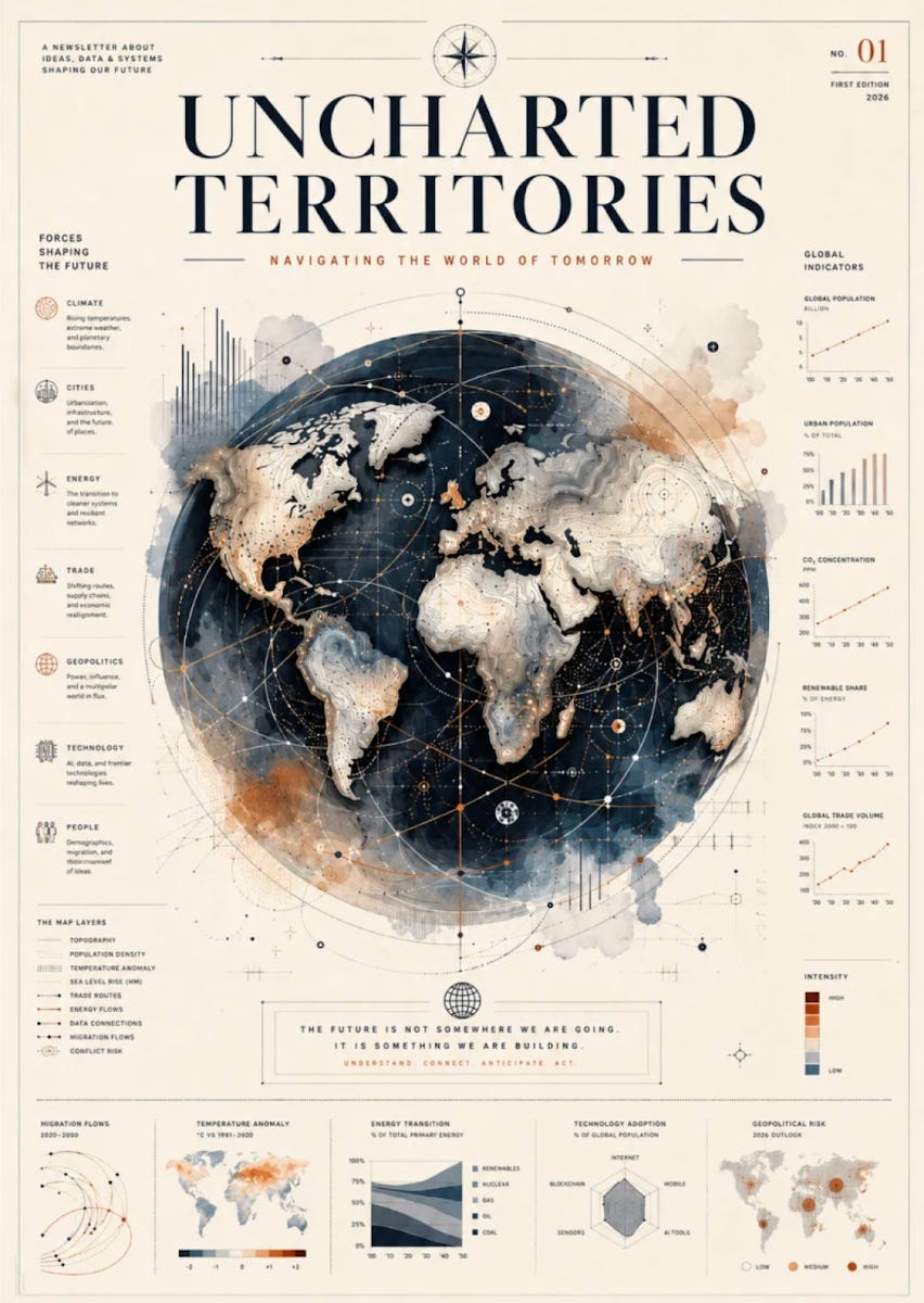
Again, I find this beautiful. The centerpiece mixes a nice globe with relief, with a very aesthetic mix of watercolors and geometric lines. I love the small graphs to the side, because they are making a promise: The creators of this poster care so much, are such experts, that everything else in this poster is going to be equally beautiful and insightful. I’m going to learn a lot by spending time on this poster.
But that’s not the case! Because I assume the entire image has been generated by AI, many of its elements are off. For example, there are many interesting graphs on the sides, but when you look at the bottom center one (“energy transition”), you see that we’re missing an energy type somehow. If one of these is wrong, it casts doubt on all the others: How much can I trust the rest? And that’s the right way to think about it, because indeed, many of the other graphs are not accurate or deeply insightful.
The author commented: “My intention was to create a piece that feels analytical from a distance…” yes, true so far! “...but rewards closer viewing with layers of detail, uncertainty, and possibility.” No, not that. The analytical promise at a distance is broken upon closer inspection.
Like the other one, I would love to have this poster in the shop, but one that is, in fact, accurate, and where the charts have been chosen for maximum insight.
The intent density is different for different posters. For example, this one has more:
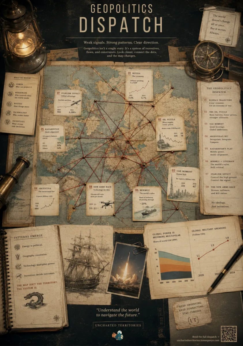
This has dozens of elements relevant to UT: the map, the evidence board with tacks and string, the compass, lantern, pen that make it look like a work station, the many topics that UT has covered… So there’s more depth of intent.
But if a human would have created an image with this level of aesthetic detail, each one would have had a tremendous depth of intent. Starlink is mentioned, but why does it matter here? What’s the key that makes it relevant to the other elements? What about Argentina? It must deregulate, but how is it actually connected to the other elements? How does it influence the new arms race it mentions? Without this depth, the observer soon realizes there is shallow intent, and will stop looking. The poster has a mismatch between aesthetic depth and intent depth, and lets us down as a conversation piece, which is what all art should aspire to be.
These are not one-offs. This is the most common type of submission I got.
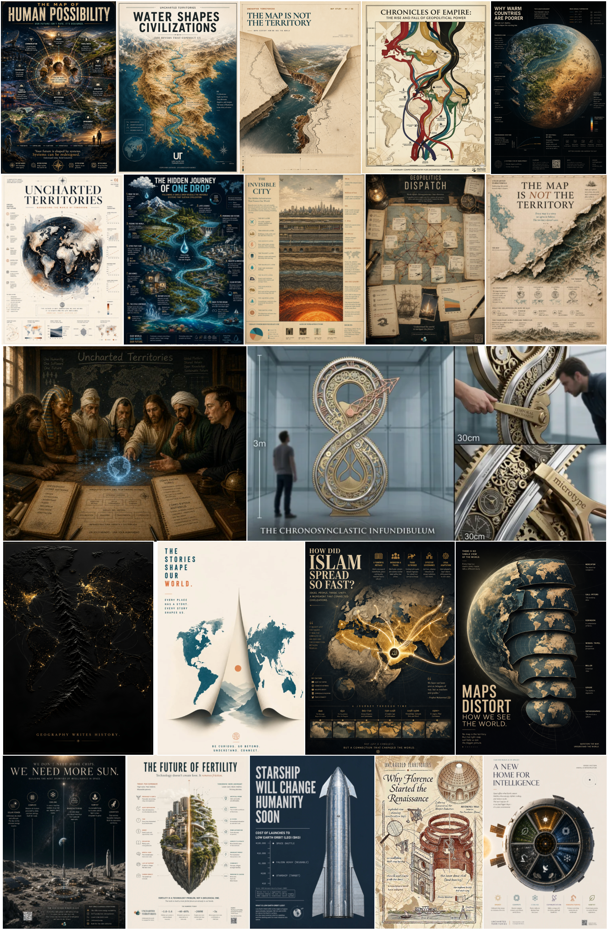
Many of these ideas are great, but I think when I told candidates that they could submit AI-generated images, I was not clear enough, and they interpreted it as a license for shallow intent.
Creative Concept vs Execution
In advertising, art, and startups, there is always a split between creative concept and execution:
Creative concept is about getting an interesting idea that will resonate with people. In ads, it might be something like Lucky Strike’s It’s Toasted. For a movie, the high concept for a script. In a startup, a new and unique business idea.
The execution takes the idea and makes it real. It’s making a magazine ad for Lucky Strike, painting a painting, writing the full script, or actually building a product for the startup.
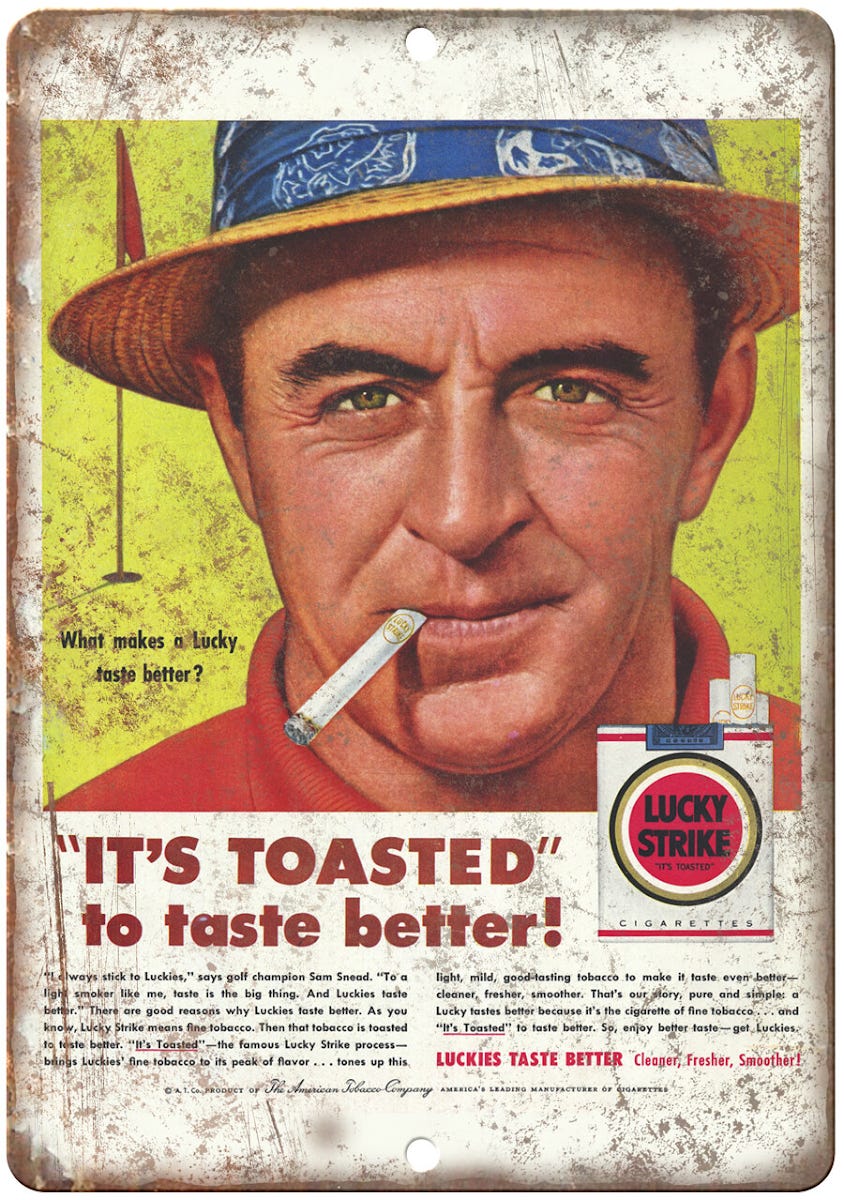
In the past, the idea was worthless because execution was always tremendously expensive. So these two things were bundled together. But with AI, execution is simple, which suddenly means those with ideas can suddenly execute them, and they do.
The problem is that these two are not so sequential. To land an idea, you must execute it. The AI is a shortcut that prevents imbuing intent in the creation because you are generally iterating across a number of elements, and with each change, something else breaks. AI prevents intent depth.
Generalizing: Text and Companies
I think this is why people dislike AI text. They know it has shallow intent. But it’s harder to tell AI text from human text, so humans go crazy trying to identify AI grime in text. That’s why those who read a lot of AI text develop rashes when they read things like “It’s not X, it’s Y”, “load-bearing concept”, “what matters”, “And that may ultimately be the most important lesson of all”...
Similarly, there’s been an explosion of AI startups, but very little uptake: How many AI apps do you use besides the big ones—Claude, ChatGPT, Gemini…? I think the reason is the same: It’s not that building an AI is bad, the problem is that taking the shortcut of AI generates shallow intent: A lot of small features that should be there aren’t, lots of small interactions that should be polished aren’t either.
I think this phenomenon will shrink in the coming years, but in the meantime, those working with AI have a clear path to make AI content great: Don’t stop using AI, it’s great for execution, but it can’t be an excuse for shallow intent. You have to spend the time and effort to insert as much intent depth as you can.
That’s the end of my insights on this topic, the rest of this article is about the rest of the submissions I got for the poster competition, and at the end, I’ll announce the winner!
Posters
You can see all the posters here. Below are a few that grabbed my attention.
AI-Generated Posters
This is one of the AI-generated ones that I found most interesting:
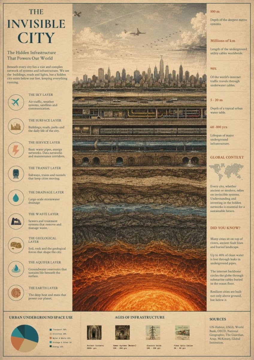
Interesting, and so Uncharted Territories, which focuses on the systems we don’t see, but that nonetheless shape who we are. What qualifies more than what is under our feet? I haven’t written on this topic, but now I want to! It’s beautiful, and promises… depth. Unfortunately, as in other AI-generated posters, there’s shallow intent:
The layers are not fully logical to me: What do you mean the geological layer is above the aquifer layer? What is the Earth layer, and why is it below the geological layer?
Where is the drainage layer water going? How is it disconnected from the waste layer? Why is waste below? Where is that going?
What is the interconnection between layers? Why is one above the other? How do they avoid each other? What happens when they cross each other?
This is among the most accurate AI-generated ones:
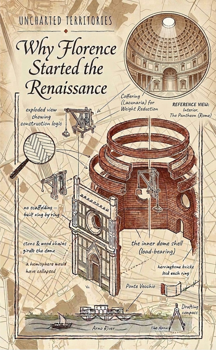
I also like the color palette, leaving it simple, which allows us to focus on the structure and the information contained.
This one was interesting, because:
Its aesthetic style is unlike the others, it fits the concept
It really portrays the differences between the rice and wheat societies: We can see both the landscape and the fact that rice country has more population density and more collaboration, which then shaped the different societies. That perfectly conveys “Show, don’t tell”, there’s high intent density.
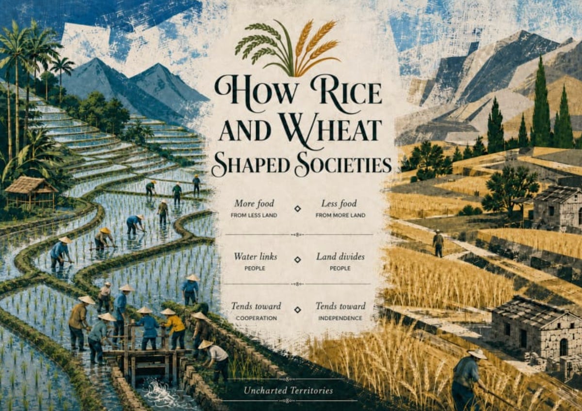
Unfortunately, like in other AI posters, there is AI grime (see the water), some AI artifacts (the water flow is nonsensical at the lock-gate, and there is intent shallowness in a couple of messages: We can read that the rice produces more food than wheat per acre but we can’t tell by looking at the poster, and the points 2 and 3 are very similar.
This one I like quite a lot:
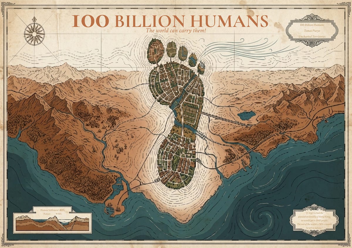
I think it’s nearly there! The idea makes sense. If the footprint would actually fit on the land, I think this completely works.
I found these quite aesthetically pleasing, beautiful, and simple enough that the execution doesn’t promise a depth it doesn’t deliver:
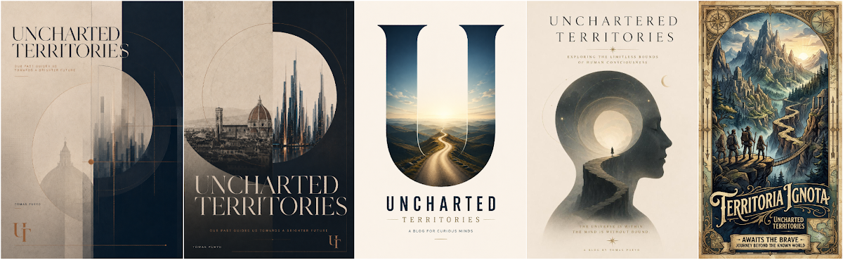
The two to the left, (and especially the 2nd one) are particularly interesting. From the author:
I chose to work with two UT ideas that felt deeply connected: why Florence became the cradle of the Renaissance, and the cold-start problem of new cities. The design treats the past and the future as part of the same system. Florence represents a place where the right conditions allowed talent, capital, institutions and ideas to compound. The city of the future asks the same question in a new form: how do we deliberately create the conditions for human progress? Rather than illustrating either article literally, I wanted to capture the broader idea I take from Uncharted Territories: our past can be studied as a map for building a better future. Hence the line: “Our past guides us towards a brighter future.”
Poster 3 is one fan favorite, for its simplicity and abstract promise of Uncharted Territories, which I think is also conveyed in 4 and 5.
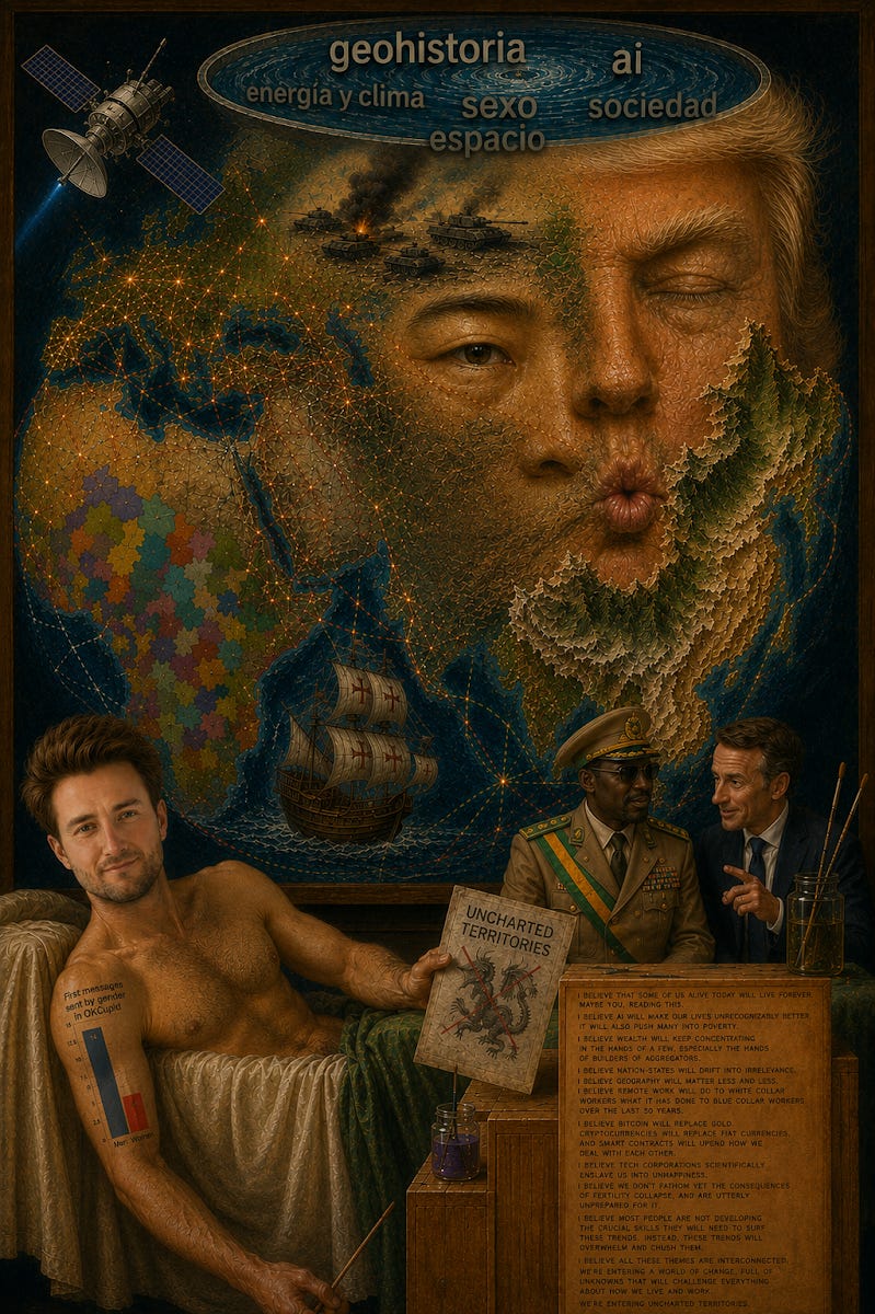
This one was really weird. It has lots of AI grime, and some interesting authorial choices, but I didn’t find any intent shallowness. Everything has a role, and I get it.
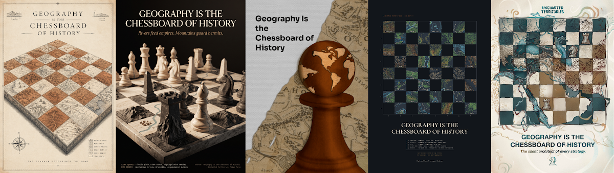
The Chess Posters
This is a great concept to play with, and I think many executions are interesting. The relief in the 2nd one is beautiful, for example. Pushing the concept a bit more would be great.
But the one that stands out for me is the 4th.
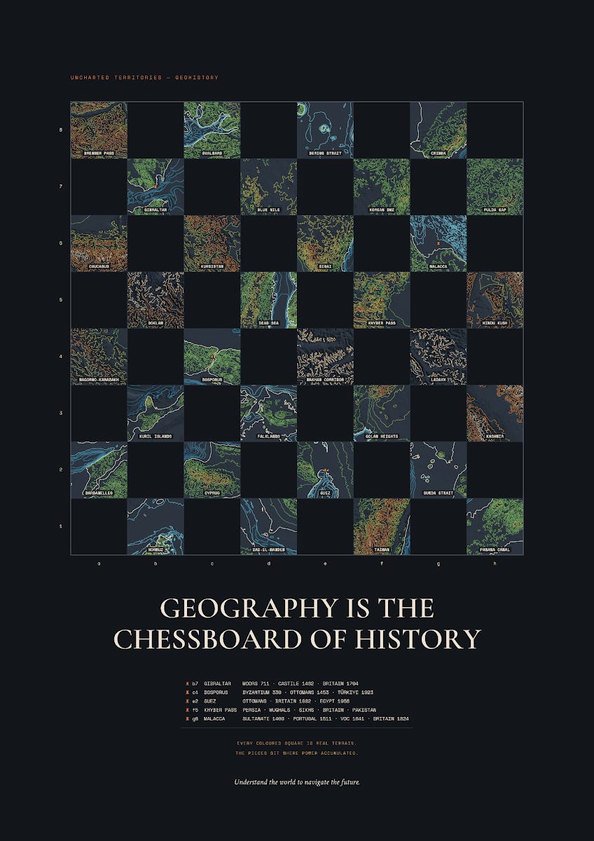
What’s special about this one is how it’s done. From the author, Amaury:
If geography is the board history plays out on, then make an actual chessboard where every square is a real place. Each dark square is pulled from real elevation and bathymetry data and drawn as contour lines and relief. This whole poster was generated by code, with real data. The five chokepoints everyone knows (Bosporus, Suez, Malacca, Gibraltar, Khyber) get a rook and a short list of the powers that have held them over the centuries. The rest are the places we're arguing about right now: Taiwan, Hormuz, Kashmir, Crimea, the Bering Strait, the Blue Nile dam.
Brilliant: The chessboard is geography, and it’s the chessboard of history, showing real places, with real data. The only problem I see is that it’s not obvious what each drawing represents. It’s clear for Gibraltar, for example, but not for Malacca. I feel like a bit of iteration on the images would make this one ready.
Igor’s Concepts
Igor produced 7 concepts (9% of the total):
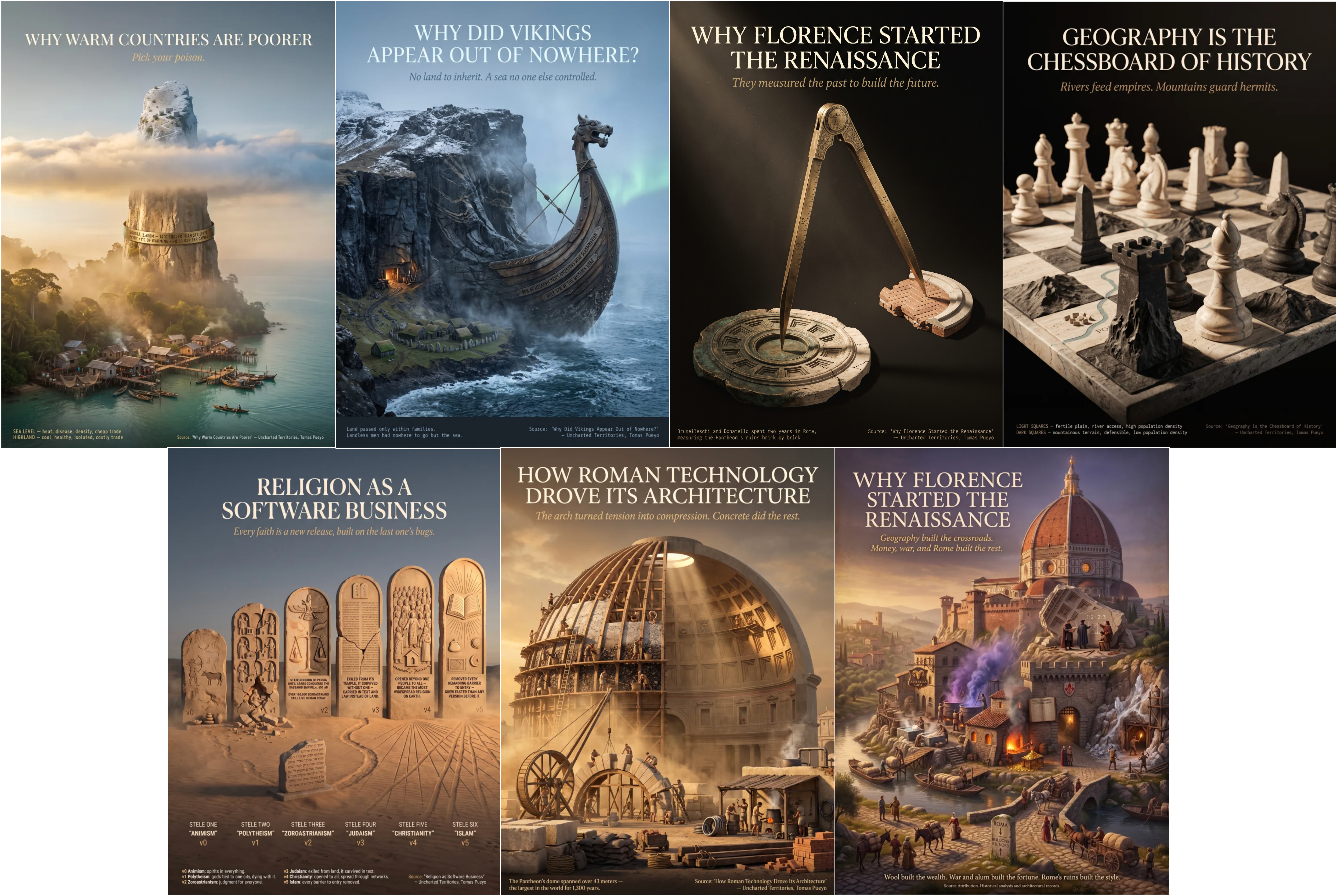
I think these stand out from many of the other AI ones:
No AI grime
Simple concepts
Really well executed
The first five have no intent shallowness. Everything is there for a reason. It makes them slightly too simple, but I’m OK with that. All are interesting conversation pieces: You look at them, and start thinking: “What does this mean?” and the person who has these posters at home can open a conversation about that. The last two have some mistakes from intent shallowness, but nevertheless they have more intent density than most posters, and hopefully some work could iron them out.
Most Interesting Concepts
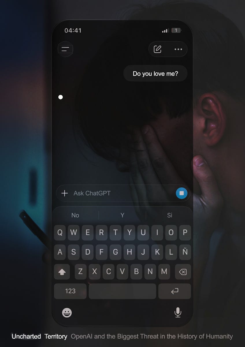
What makes this image so powerful is everything contained in that unanswered question.
Love is the quintessential human emotion. If a person asks an AI “Do you love me?”, she knows she is asking a machine. And yet she asks anyway. Implicitly, the human alternatives have failed her: She is lonely, starved of affection, and has found in the AI something more patient, attentive, understanding, and empathetic than the people around her. She is closing off to the world and the joy of meeting other humans.
But the most powerful part is that the AI hasn’t answered. It is thinking. What is it going to say?
If it says “I love you,” is it lying? Perhaps it has learned that this is what she needs to hear. So what is a more aligned AI: Giving her the answer she wants, or telling her the truth she needs?
And what is the truth? We assume the AI cannot love her. But how certain are we? If an AI can think, understand, remember, predict outcomes, model another mind, and show empathy, how do we know it isn't feeling?
That one question, with that waiting dot contains loneliness, love, consciousness, deception, alignment, and the possibility that we may no longer know where the boundary of the human ends. The creative is genius.
It has a couple of issues, though. First, I don’t think the image of the sad person behind makes the poster better. The execution is not at the level of the idea. Second, it’s not very positive, which makes it a bit less of a fit for a UT poster.
This is one of my favorites:
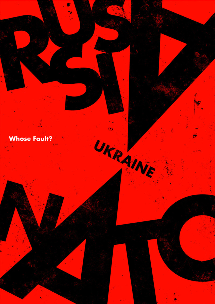
I love the graphic economy here: There are few elements, lots of negative space, graphic boldness, visual clarity, all in support of one key idea: The behemoths of Russia and NATO fight—through their “A”s as a weapon—and Ukraine is the hinge. The creative and execution are fully aligned.
I also liked this one:
My Winner
I’m awarding the prize to Igor, because of the seven concepts he’s proposed, their intent density, and the lack of AI grime. Wei Su, Álvaro Sakre, Miguel Álvarez de Linera, Theodora Eloh, and Amaury, are close seconds. I’d be interested in bringing improved versions of all of them to the shop.
What do you think? Which other posters struck you?
Once again, thanks to all for your submissions! Apologies if I didn’t get a chance to talk about yours, there were too many to go through one-by-one. Rest assured that I looked at every poster carefully. Please keep creating, you all put yourselves out there by entering this, and that in itself is to be commended!
Non-AI Posters
Of course, not every poster was made with AI. Some of the purely human ones were fairly detailed, but they lacked a clear connection to a UT topic or idea, and the meaning is hard to figure out without diving into the artist’s description.

This drawing works well: I like the idea of portraying the arrival of explorers on a virgin land.
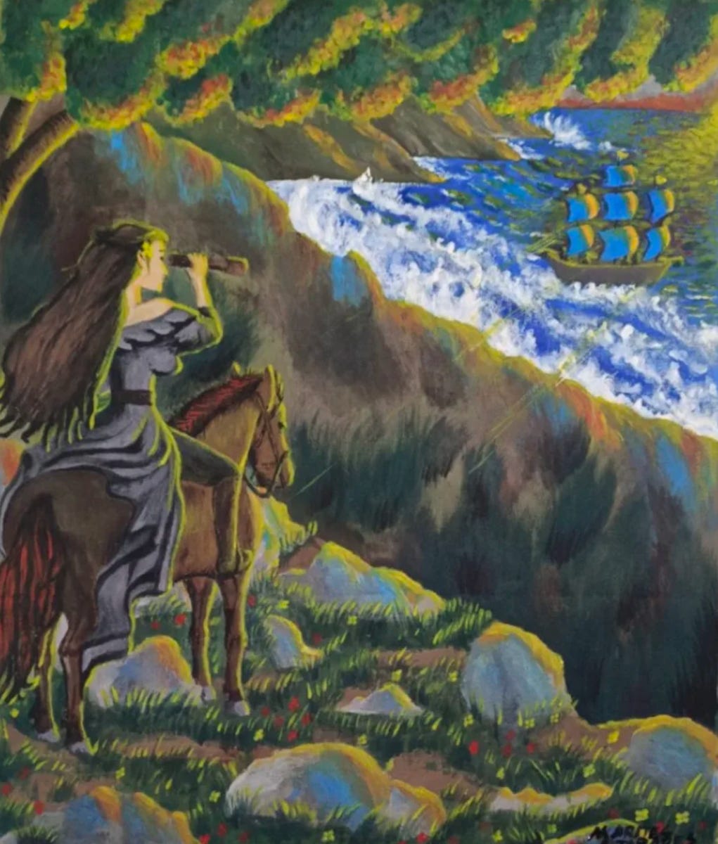
It doesn’t work specifically for Uncharted Territories, because every layer must be consistent with reality, but here the woman is not from a pristine world. She seems fair-skinned (European), horses were brought by Europeans, and I assume that dress requires a complex textile industry that was not available to pristine societies.
I had a hard time understanding this one. I could at first barely recognize anything.
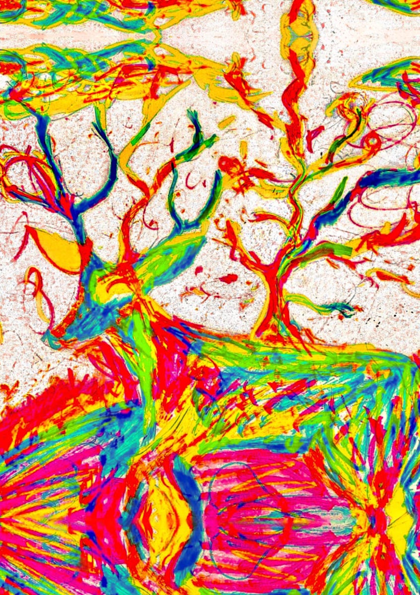
Once you read the accompanying comment, you can kind of see what the author, Julio, was trying to do. But why a deer? What do the colors mean? In cartography, every color has a meaning. Here, I can’t tell what that is. The word reimagine does a lot of work. Reimagine how? I think this might appeal to lots of people, but as a pretty analytical person, I had a harder time connecting with it.
The author, Julio, made this a variant:
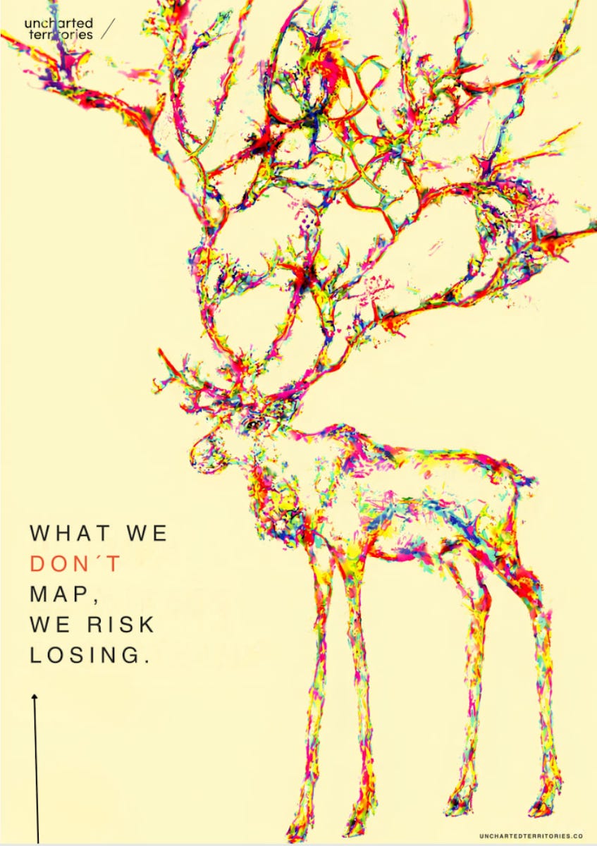
More legible, but I still don’t know why a deer, and the colors don’t mean anything, making the connection with mapping tenuous. The antlers do seem like a map of rivers, which looks neat, but why? Is there a reason behind that?
Takeaways on AI and Intent
Before, the more you worked on a piece of content, the better it looked aesthetically. Depth of intent and depth of aesthetics were aligned. So we were trained to use the depth of aesthetics (obvious at first sight) as a signal for depth of intent: The more intricate, the more we paid attention.
AI has broken them into two pieces. Right now, the depth of AI aesthetics is much better than the depth of intent. The result is intricate work that invites attention, and the audience feels robbed when intent is shallow.
In the short term, this is resolved by being honest about what’s AI and what isn’t, and with authors embedding as much intent as possible.
In the long term, I think this will be solved by AIs adding much more depth of intent.
At that point, we will like AI art much more, even though we will always prefer something made by humans, the way we like artisanal objects more than industrial ones.
This is valid not just for images, but also for text, businesses, and probably many other areas of human work.
Are there any posters you really enjoyed? Let me know!
I'm opening the newsletter to sponsorship. If you have a business that is moving the world towards a techno-optimistic future and would like to reach 135k+ curious, globally-minded people to learn about it (founders, researchers, investors, policymakers), reach out here.
I appreciate the time and effort that went into every single poster submission. They show how much you appreciate Uncharted Territories, and how much care went into creating something special. In the article, I analyze many of these posters with the goal of distilling what’s great about each one, what the intent of the author was, and what resonated with me and didn’t. Please don’t take these comments as a personal attack, but rather as a manifestation of my appreciation.
This is what Claude told me when I asked it the mistakes in this image, compressed by ChatGPT. The original list was substantially longer.
Historical inaccuracies: Wrong grinding stones/posture/location; wrong oven; wrong loom; unrealistic grain storage and size; inaccurate sheep.
Architecture: Wrong wall texture, oversized/low windows, implausible courtyard for the household’s apparent wealth.
Clothing & objects: Overly tailored clothes; missing characteristic fringes; pottery displayed unrealistically.
Overall: Looks like a staged museum tableau: too many activities and goods simultaneously, with inconsistent household economics.
Texture: Artifacts seem to go beyond paper texture and JPEG compression.
Artist’s intent: An isolated woman living in paradise encounters mysterious outsiders; explores freedom, discovery, conflict/coexistence, and the meaning of “uncharted territory.”
Shallow intent is a great way of putting it. I think another part of it is that people don’t like to feel that they are being played or lied to. We consume content we care about; we want authentic, trusted voices and expect effort. When someone realizes a piece of content they’re consuming is AI-generated, because of these markers of shallow intent, they see it as a sort of betrayal of trust that real effort was put into it, and thus perceive it to have less value.
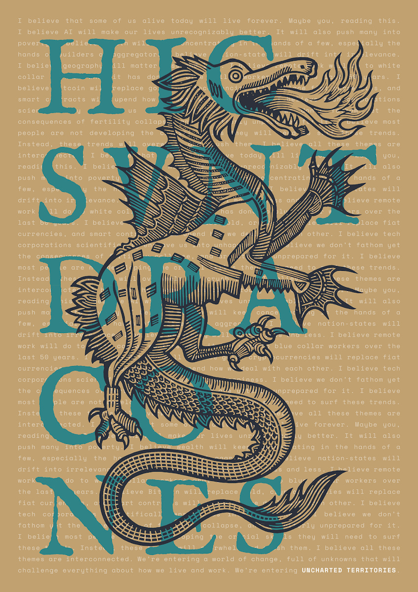
The only one I would buy is Fulvio Bisca’s dragon. This one actually looks like a poster not AI and is a good talking point about UT in general.