
Iran

After Israel’s attack on Iran, the big question is: What will happen in Iran? Will the regime fall? If so, how? What will other superpowers do? To answer these questions, we must first understand why Israel and Iran are the way they are. You can read the articles on Israel here, here, here, and here. For Iran, two maps capture the essence.
Two Maps That Explain Iran

The first shows us that Iran is in the middle of everything. Throughout its history, it has confronted superpowers to its west like Babylon, Greece, Rome, the Ottoman Empire (now Turkey), the British Empire, the US… To its north, Russia. To its northeast, it has suffered dozens of invasions from nomadic people, the most famous of which were the Mongols. Nowadays, we must add Israel, Saudi Arabia, and Pakistan.
And for all these civilizations to communicate over land, they must pass through either Iran or the small gap between the Caspian Sea and the Ural Mountains in Russia (red arrows on the map). Iran is in the middle of a highway, with dozens of powers interested in controlling it.
This is the second map:

Iran is a mountain fortress. Here’s another visualization of Iran’s topography:

The ramifications of these two facts—a fortress in the middle of a highway—have determined a lot of Iran’s history, its present, and its future.
1. A Mountain Fortress
Although Iran is exposed to all these external threats given its location, it’s huge. With 1.7M km2 and a population of 90M people, it is 70% larger and has more population than Afghanistan and Iraq combined. If Afghanistan was hard for the US to control, imagine what it would be like to invade Iran.
Because, like Afghanistan, Iran is well protected from foreign invaders by its mountains, deserts, and seas.

This is what the Zagros looks like:

Interestingly, the Zagros Mountains created nearby Mesopotamia.

Mesopotamia, of course, is one of the first places where civilization emerged, because the banks of the Tigris & Euphrates rivers are so fertile. Very tempting for Persians:
On plains, people tend to settle down, establish civilizations, and get rich.
Mountains prevent people from establishing similarly stable and prosperous civilizations. Given their isolation from one valley to the other, they also remain violent for longer. The lower fertility of their lands means more roaming lifestyles. All these factors push them to covet the wealth of the civilizations on the plains.
While it’s difficult for a lowland people to attack through mountains, it is easier for a
mountain-based people to descend onto the plains. This dichotomy between mountain people and plains people was evident as early as the Babylonian / Median times, around 600 BC:
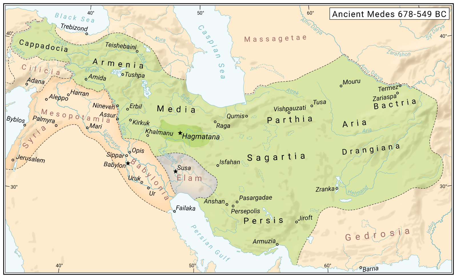
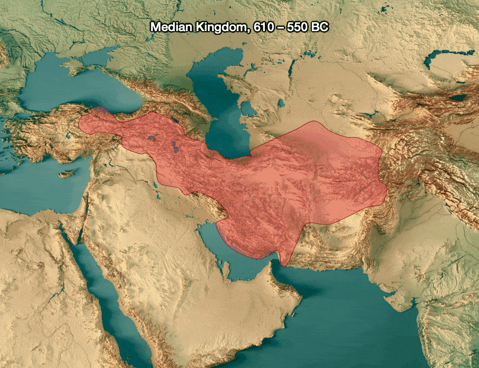
Soon after, the Achaemenids from Persia conquered Mesopotamia:

Over Iran’s history, the Persian mountains and Mesopotamia were frequently united:
Most of the time, the union came from Persian invasions (Achaemenids, Parthians, Sassanids, Seljuk, Mongols, Safavid), but a few times, the invasions went the other way: Iran has been invaded five times from Mesopotamia, by the Akkadians, Assyrians, Greeks, Arabs, and the British in WW2.1 Although this sounds like a lot, note that since the Greek invasion (330 BC), Iran has only successfully been invaded from Mesopotamia twice in the last 2,300 years, in both cases while being hugely overpowered.2 The Romans tried for 5-10 centuries and failed. Iraq’s Saddam Hussein learned the hard way that this country is unassailable, during its eight years of war with Iran between 1980 and 1988.
Iran was successfully invaded seven more times3 via another path: the Central Asian steppes.

Invasions from the steppe basically stopped once gunpowder was invented and horse-mounted steppe warriors could be defeated. But there’s just desert or steppe there, so not much wealth to be gathered for Iranians.
The rest of Iran is well protected. To the northwest, there are the mountains of Anatolia. Farther north, the very tall Caucasus makes it nearly impenetrable. None of these are very valuable terrains.
Persians have never expanded through the seas to the north (Caspian) and south (Persian Gulf) because given its size and position as a land crossroad, Persia had to develop strong land armies. That investment prevented seafaring investments and expansion.
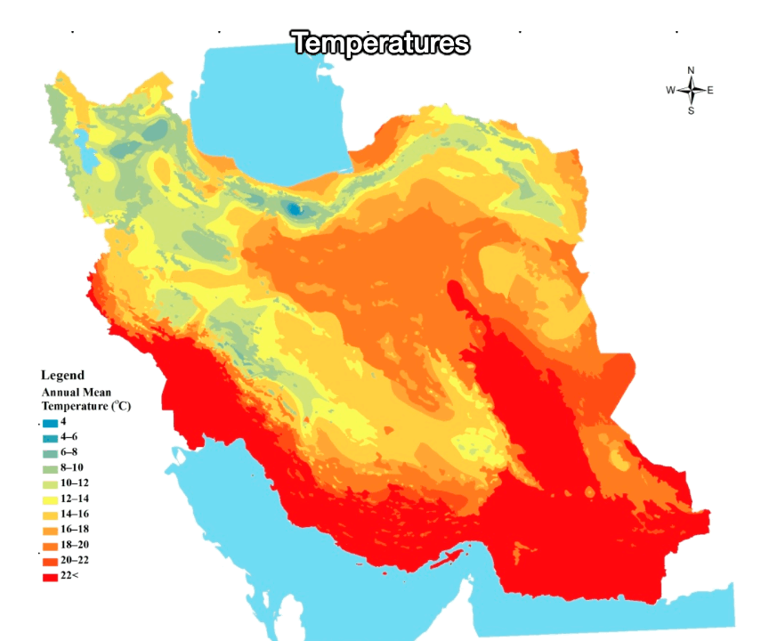
To the east are Iran’s deserts of Darsh-e Kavir and Darsh-e Lut, where some of the highest temperatures on Earth have been recorded:

Beyond these deserts are some mountain ranges, and then the even taller Hindu Kush mountains. These form excellent buffers, but provide very little wealth. You don’t go to Afghanistan to strike it rich, and Afghans are not usually rich enough to conquer Iran.
In summary, one of the big consequences of Iran’s geography is that the country is quite exposed to foreign attacks and invasions, but generally well protected, mainly thanks to its mountains and deserts. On top of this, it’s surrounded by pretty worthless terrain—mostly mountains and deserts, except in Mesopotamia to its west, making it the only natural expansion route for Iran.
Unfortunately for Iran, these mountains and deserts don’t just protect it, they also trap it. Invading its neighbors is a nightmare, as logistics for big armies over big mountain ranges and deserts is very difficult. It’s not a coincidence that so many invasions came from steppe warriors in the northeast: Their nomadic lifestyle allowed them to travel with their food (mainly horses and sheep). To the west, Mesopotamia is very close, but as Iran discovered in its eight-year war with the smaller Iraq, it simply could not muster the logistics to beat its neighbor: Resupplying a huge army over the Zagros mountains is so hard!
Another consequence of Iran’s geography is its wealth—or rather lack thereof.
2. Iran’s Chronic Poverty
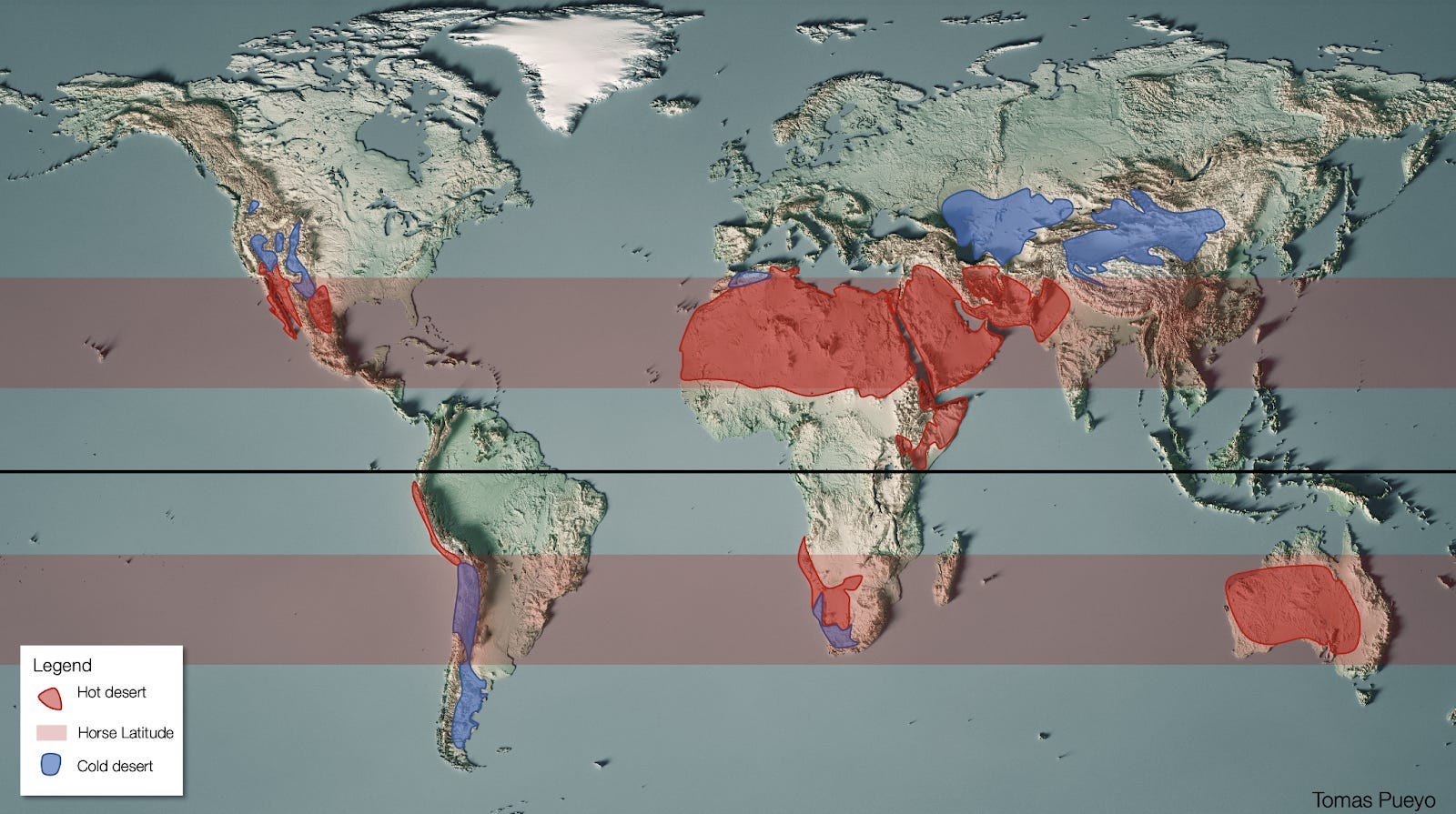
In more temperate areas like the US, Europe, or East Asia, few people live in mountains because they’re too cold and make transportation too expensive. But Iran is very warm and dry because of its latitude.
Temperatures can be scorching hot, like in the deserts we saw pictures of before:
That means mountains are the best place for people to live.
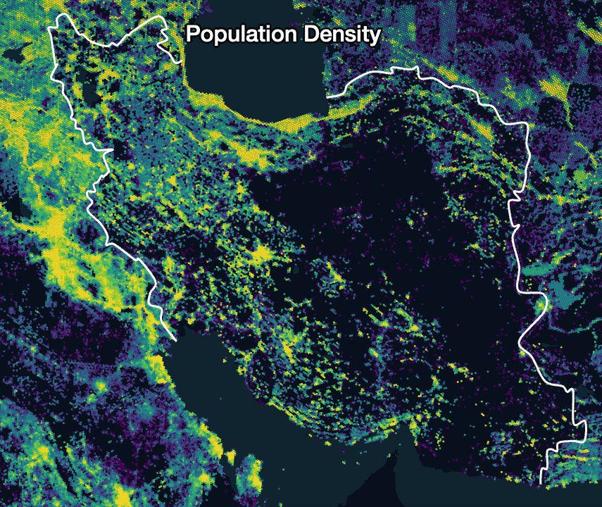
High elevations are cooler, making temperatures comfortable. Mountains catch water from the wind, necessary for agriculture and living. We can see it in this picture of Tehran, the capital of Iran:
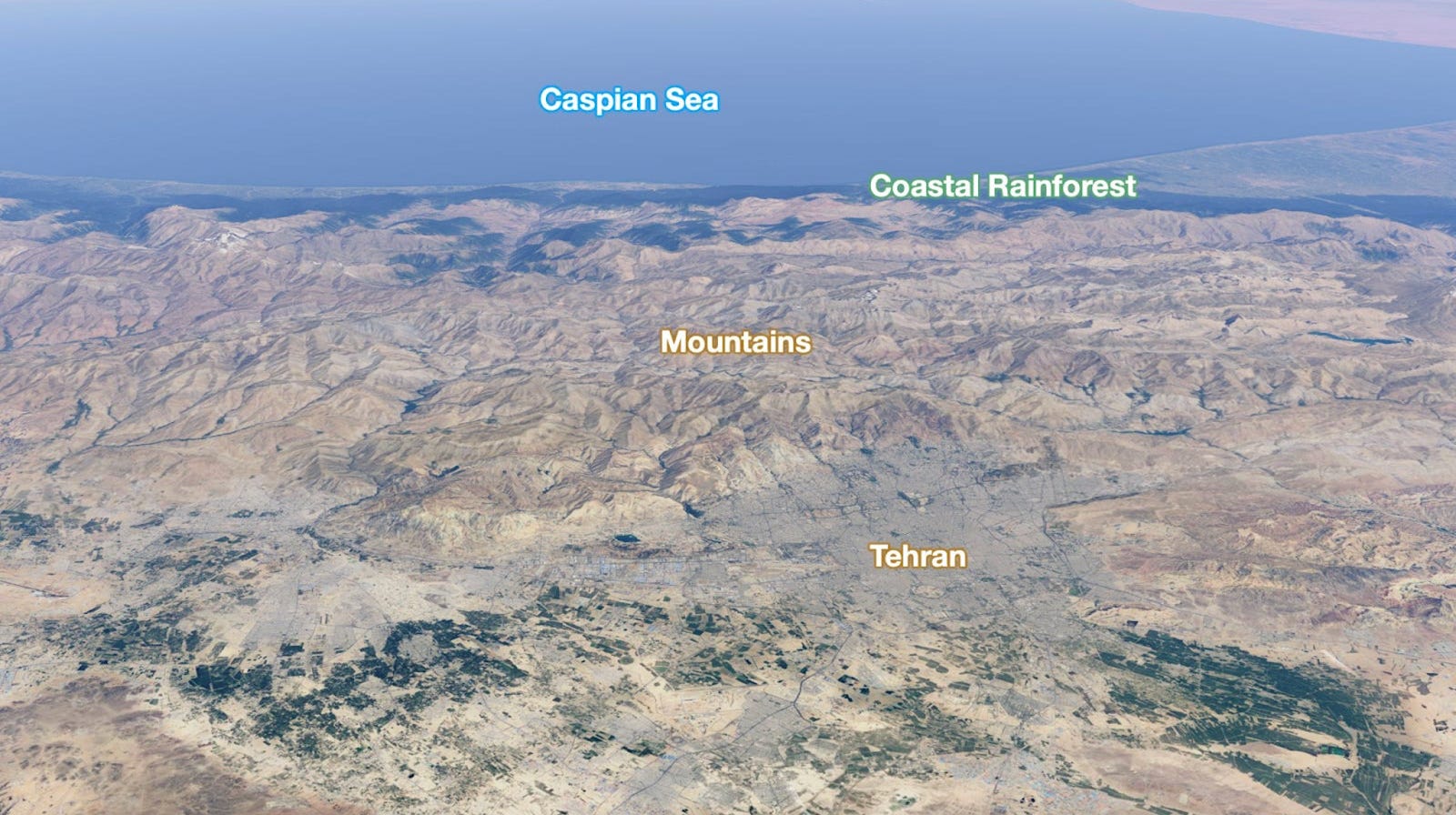
Here’s a picture of the city and its mountains:

We can see that generalized in this map of precipitation vs topography:
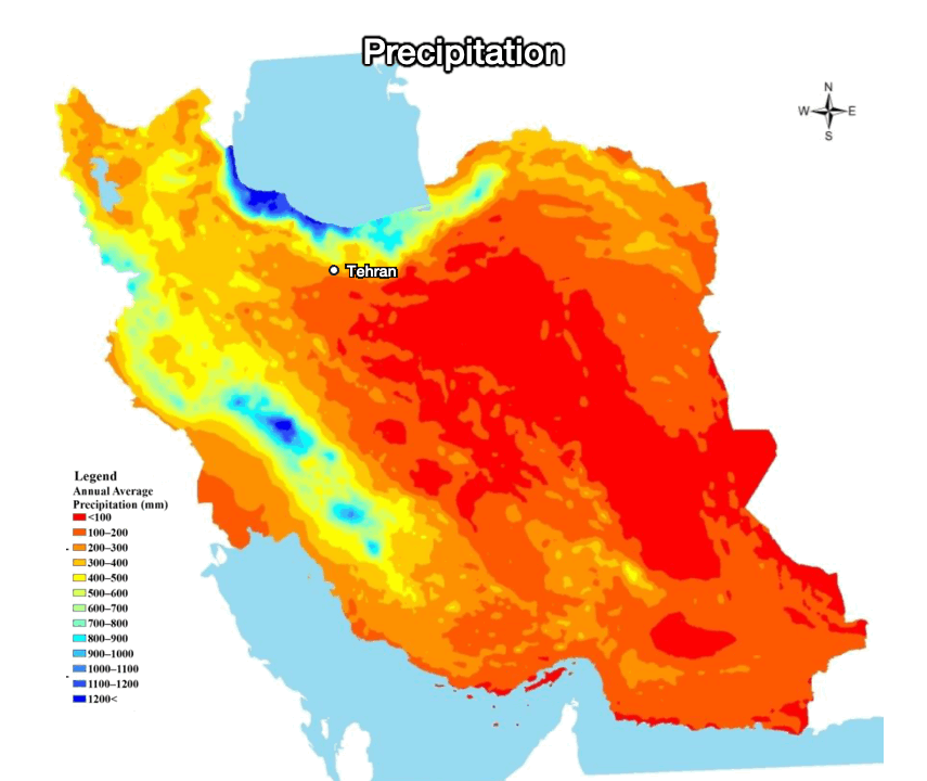
Mountains mean poverty, as they make transportation and infrastructure costs exorbitant. And as we just saw, trade is extremely sensitive to transportation costs, so mountains mean little trade and little wealth building. We saw something similar in Mexico and Brazil. This means Iran is structurally poor.

3. Ethnic Diversity
Another consequence of the high transportation costs and low levels of trade caused by mountains is that communities remain separate, bringing ethnic diversity—Balkanization. Iran is a highly diverse country.
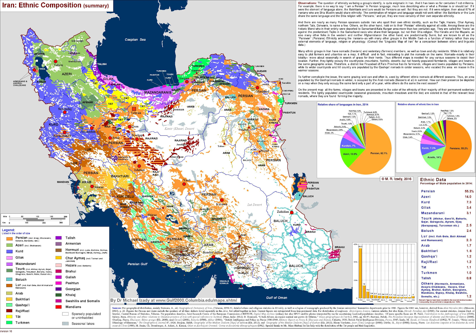
Persians account for ~60% of the population, mostly in the mountainous heartlands. But the entire periphery is sprinkled with other ethnicities. Azeris make up about 15% of the population, living mostly in the northwestern mountains close to Azerbaijan. Did you know there are more Azeris in Iran than in Azerbaijan?!4

Kurds in the northwest (and northeast!) account for ~7% of the Persian population, and ~25% of the world’s Kurdish population.
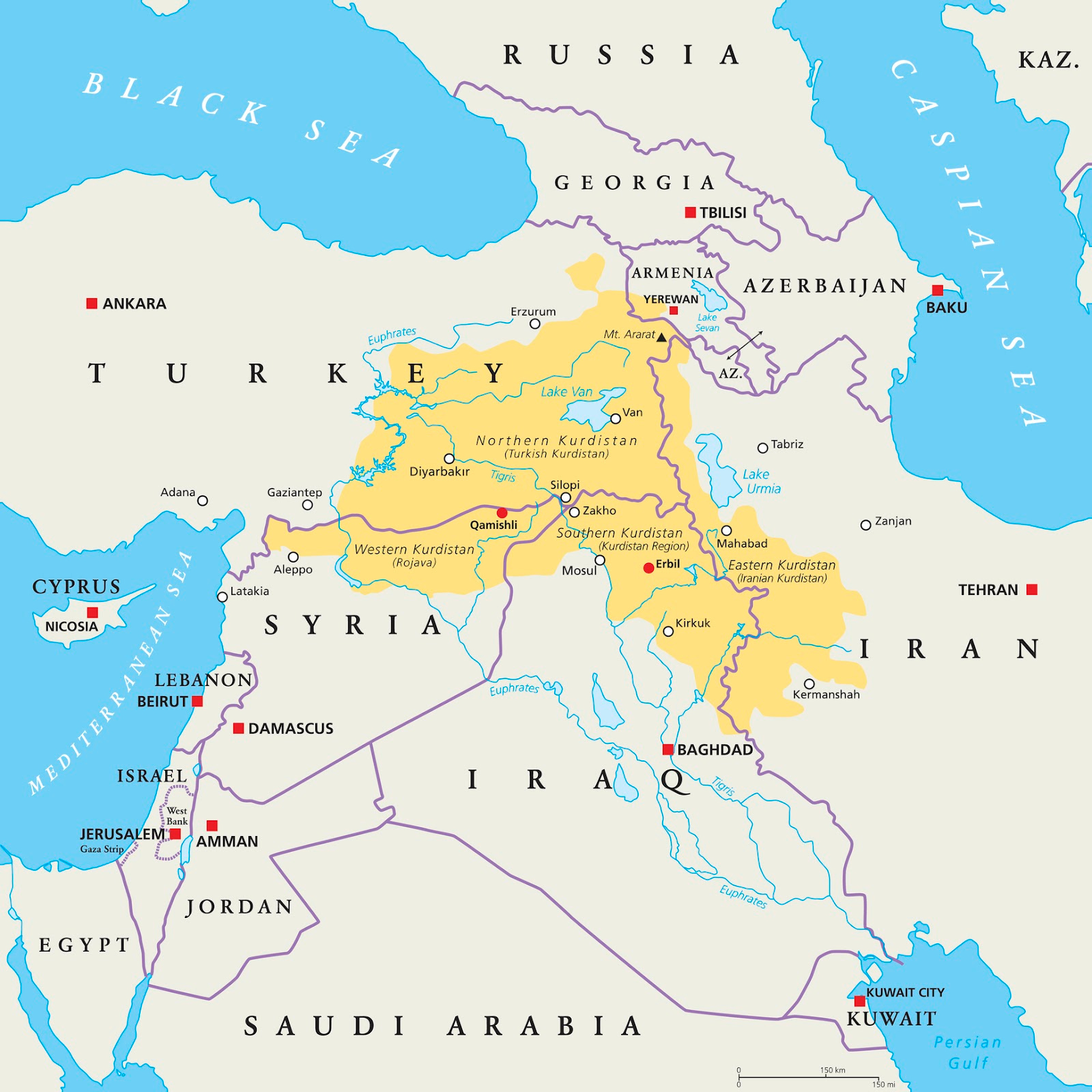
There are Arabs in the southwest, in the Khuzestan lowlands. These are quite special because:
First, this is part of Mesopotamia!
Second, the locals are Arab, like Iraqis!
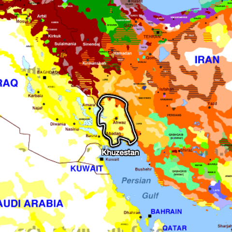
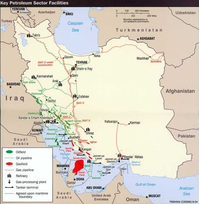
Third, this is where most of Iran’s oil fields lie!
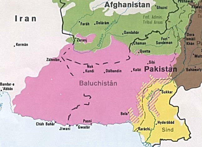
And there are more! Baluchis, in the southeast, also straddle Afghanistan and Pakistan.
Gilak and Mazandaranis on the Caspian coast, Tourki, Tati… You can imagine this is not good for the country’s unity.
Of course, religion exacerbates the problem, as most Iranians are Shia, but Kurds, Baluchis, and a few others are Sunni.

Historically, the only way to handle this was with broad autonomy.
The Persian Empire represented the world's first superpower that was based on a model of tolerance and respect for other cultures and religions.—History of Iran, Wikipedia
This is what you find in a country like Switzerland today. But it’s hard to keep such a diverse country unified. Frequently, it devolves into violence, like in the Balkans, Mexico, Afghanistan… So, as the tools of centralized control have developed over time, they have opened another alternative path to unity: surveillance, control, and suppression. This is one of the reasons why the Iranian state is so repressive and authoritarian.
We’re now poised to understand the challenges of present-day Iran.
Iran’s Main Priorities
Iran has five priorities.
Priority 1: Securing Borders
Iran is in such a central position, and surrounded by so many powers, that its first priority is to secure its borders. This is mostly achieved already.
Going clockwise, starting with the border with Turkey:
Between Iran and Turkey are the Zagros. Of all the invasions Iran has suffered, none successfully used this path. On top of this, today this region is inhabited by Kurds on both sides of the border. They are hostile to Turkey, and would be unlikely to help in case of an invasion. Figuring out logistics through these mountains would be a nightmare, and Turkey is in no position to do that.
The northwest is well covered, with the tall Zagros and Alborz mountains and weak buffer states like Armenia, Azerbaijan, and Georgia. North of them is the even taller and more impenetrable Caucasus, which also has separatist movements, including the Chechens, Abkhazians, South Ossetians, Dagestanis, Ingush... If Russia has a hard time invading Ukraine over plains, imagine invading Iran over this. Impossible.
The Caspian sea could hardly see a successful attack from Russia either, since it would need to immediately climb the Alborz mountains, very unlikely to succeed.
To Iran’s northeast is Turkmenistan, which has 10% of Iran’s population, and is on the steppe—convenient when mounted warriors were all the rage, not great when it can be shelled at will from the mountains. The five Central Asia -stans together have a smaller population than Iran. The region between Turkmenistan and Iran is also desertic, making logistical support even harder.
Pakistan and Afghanistan are dirt poor, and separated from Iran’s heartland by ranges of mountains and impenetrable deserts. Only one invasion ever succeeded through this route, and that was during a time when Iran was extremely weak. Afghanistan and Pakistan can’t mount an attack here.
The sea to the south is pretty safe. First, because desertic mountains rise immediately from the coast. Second, because 40% of the world’s oil flows through this region, so the world’s maritime superpower (the US) wants to make sure it is safe and oil keeps flowing.
This leaves its southwest corner of Khuzestan as the only area that is somewhat exposed, especially given its oil, that this is where Iraq attacked in 1980, and that this is where five invasions succeeded in the past. Despite this, Iran can feel reasonably secure:
It’s marshland
Iran has a strong influence in Iraq
Iraq learned empirically that it can’t take that region
The US would prefer to keep the oil flowing than to take over this region
So Iran has achieved its primary goal of border security. If you hear people say “Maybe Israel and / or the US could put boots on the ground in Iran”, send them this article and tell them to stop smoking psychotropics.
Priority 2: Internal Unity
Iran’s heartland is solidly made of Farsi-speaking Shia Persians. But its peripheries are all occupied by minorities that straddle neighboring countries. This can remain stable, but only as long as Iran’s security apparatus can project its power and violence. If it falters, Iran’s position will be precarious.
Foreign powers know this, so this is how they would try to weaken or topple Iranian power: By supporting separatists. At the height of US involvement in the Middle East, this was a serious risk, as the US had boxed Iran through its presence in Iraq to the west, Afghanistan to the east, and its alliance with Pakistan to the southeast. During their time there, the US did support separatist movements in the Arab Khuzestan, in Kurdistan, in Balochistan… Now that the US is out, it’s much less of a risk.
If I were Israel and I wanted to topple the Iranian government, I would ferociously attack its security apparatus, sow discord to provoke internal discontent, and support the bordering separatist movements.
Priority 3: Freedom from Foreign Interference
The superpowers that can interfere in Iranian affairs are Russia, Turkey, Saudi Arabia, and the US. Of those, Iran’s fears are first and foremost towards the US, because the US:
Used a puppet to control Iran before the Revolution of 1979.
Boxed Iran between enemies during its presence in Iraq and Afghanistan, and through its alliance with Pakistan.
Supported separatist movements in Iran.
Is a liberal democracy, while Iran is an authoritarian theocracy.
For all these reasons, Iran has not been able to find peace with the US. This is why it has pursued a nuclear weapons program.
Priority 4: Trade Oil
Iran wants to trade its oil internationally, but its efforts are undermined by US sanctions, which are there because of Iran’s nuclear weapons. In turn, the lackluster economy causes internal dissent, which forces Iran to prop up its internal security even further.
Frankly, sometimes this is frustrating, because it feels like the US and Iran could just be more friendly and none of this would happen.
Priority 5: Project Power Towards the Mediterranean
Iran would like to go back to its glory days when its influence reached the Mediterranean. This is one of the reasons why it had proxies in Iraq, Syria, Lebanon, and Gaza. Of those, Israel has exterminated its influence in Lebanon and Gaza, and Syria fell mostly due to Turkish support. Its only influence left is in Iraq.
Iran is rattled by this, but finds itself helpless in this situation for now.
Takeaways
Iran is basically impenetrable. Its only region at risk is the Arab Khuzestan to the southwest, but even that is relatively protected.
Its biggest threats are from the US and Israel:
The US can’t invade Iran, but the US has influenced the country too much in the recent past. The Iranian government fears being toppled, so it has been developing the nuclear bomb. The US has countered with sanctions, which have impoverished the country dramatically.
Israel will never invade Iran, but it has been able to negate Iran’s projection to the Mediterranean, and is an emerging power in the region. As of today, it constitutes Iran’s main risk, as Israel is eliminating Iran’s internal security forces, which could trigger internal dissent and separatism.
And this is the context of Israel’s bombing of Iran, why it’s attacking its nuclear arsenal and its internal security forces, and why it’s calling on the US to help.
But why is Iran against Israel in the first place?
What about Turkey? Saudi Arabia?
Why is it friendly with Russia?
Can it become friendly with the US?
What is the most likely outcome of this conflict?
What about the Iranian population? Do the people support the theocracy? What’s its role in this?
These are the questions I’m going to tackle in the premium article later this week. Subscribe to read it!
I’m only considering successful invasions here, defined as those that reached the capital, took it, and overthrew the existing rulers. I’ve included the Ghaznavids because, although they didn’t really reach a Persian capital, that’s partly because Iran was divided back then. They actually united most of Persia.
Persia was conquered by Arabs among other reasons because Persians were exhausted after one thousand years of wars with Roman empires. In WW2, Iran was completely overwhelmed by the combined power of the mighty British and Russians.
By the Parthians, Ghaznavid, Seljuks, Khwarazmians, Mongols, Timurids, and Soviets.
From Wikipedia: Between 12 and 23 million Azerbaijanis live in Iran, mainly in the northwestern provinces. Approximately 9.1 million Azerbaijanis are found in the Republic of Azerbaijan. A diaspora of over a million is spread throughout the rest of the world.
I read this with great interest. One thing that I found missed is that priority 3 could do with more fleshing out. You mention that the US used a puppet to control Iran, but I think it's important to understand that in the early 1950's Iran felt the US was its greatest friend. At that time Iran had a democratically elected government and was fighting for independence from England (sound familiar?) The betrayal of this with the US-supported toppling of Mosaddegh followed by the puppet ruler that you mentioned is still huge. This happened a generation after WWII and we don't think twice when we talk about the scar WWII left on the psyche of Israel.
It is important to understand why the US is considered enemy #1 and in my mind the betrayal plays a major part.
Tomas - I am a big fan of your work and thoroughly enjoy reading your posts. But I want to flag one statement you have in this "The Iranian government fears being toppled, so it has been developing the nuclear bomb." The conclusion of 18 U.S. intelligence agencies, as reported by the Director of National Intelligence, is that Iran is not currently seeking a nuclear bomb. Additionally, the IAEA has stated as recently as yesterday they have no proof Iran is currently seeking a nuclear bomb. Happy to provide links for those if needed. The statement is important because it is being used as a casus belli by Israel to attack Iran despite no evidence, as was the case with the U.S./Iraq in 2003.